How to Use Team Collaboration Features in Openkoda PAS
Follow one hand-over end to end: a chat message carrying the policy, a task with an owner and a due date, and the notification that reaches the assignee.
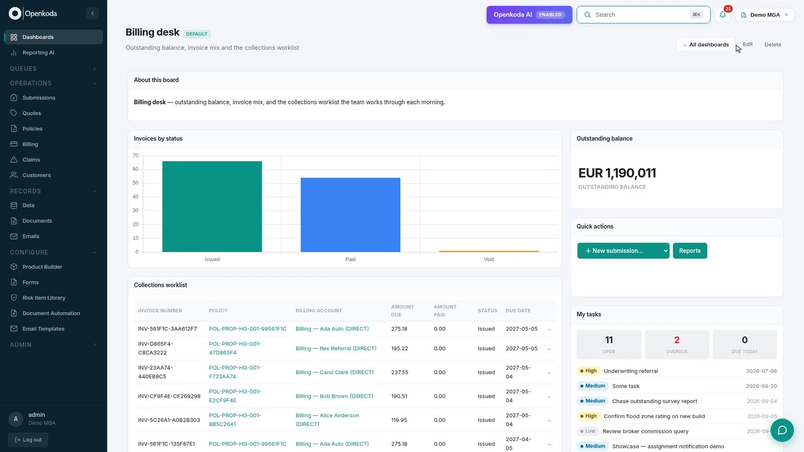
Build a billing desk board tile by tile, then a second one by describing it in a sentence, and make one the screen your team signs in to.

Most dashboards in insurance software are decoration. They are built once by whoever installed the system, they show what that person assumed a manager wants, and within a month everybody has gone back to running the same three exports into a spreadsheet.
The ones people actually use have three properties, and none of them is about the charts:
That third one decides the other two. If a dashboard is configuration - pick a widget, point it at an entity, drop it on a grid - then the person who knows what the desk needs can build it in an afternoon. If it is a development ticket, you get the wallpaper.
So what does a good one actually look like on the page? It comes down to a handful of choices:
This walkthrough builds a billing dashboard tile by tile, then builds a second one by describing it in a sentence, and finally makes one the screen the team lands on.
Before you start, you will need: an account that can reach Dashboards and Reporting AI.
There is a video version if you would rather watch it. It is short; the written steps below are the ones worth having open while you build your own.
Signing in does not open a menu. It opens the organization’s default dashboard.
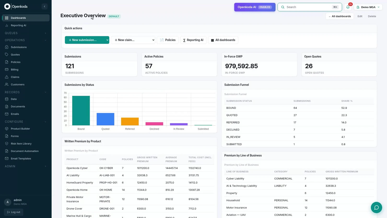
Worth noting before you build anything: whatever you make can become this. That raises the bar, because the first screen of the day should answer the first questions of the day.
Our billing board wants a breakdown that no standard widget produces, so make it first. Reporting AI takes the question in plain English and writes the query.

Be specific about ordering and rounding in the question itself. “Biggest first, rounded to whole numbers” is the difference between a report you can put on a wall and one somebody has to re-sort every time they read it.
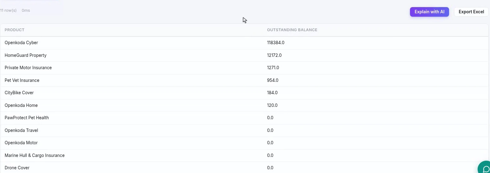
Read the numbers before you save. A report that runs is not a report that is right, and this one is about to be embedded on a board the whole desk reads.
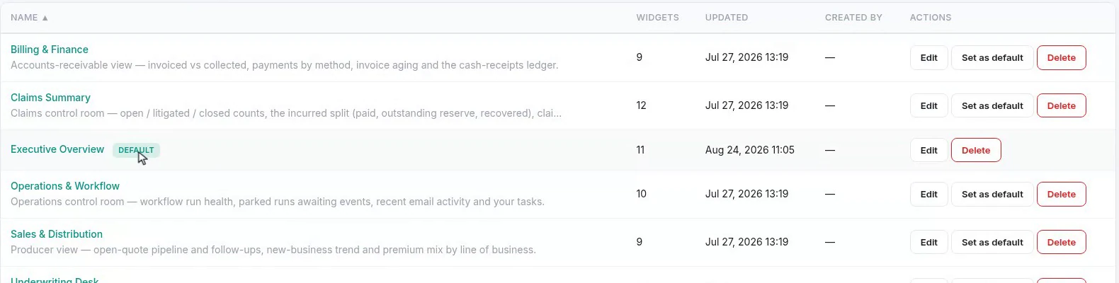
Every board the team has built lives in one list, with its widget count and the option to promote it.
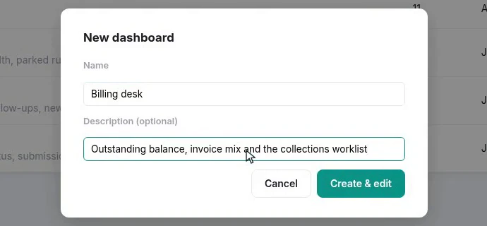
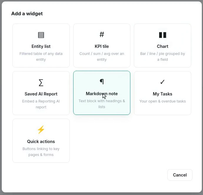
Seven is the entire vocabulary, and it is worth reading as a list of intentions rather than components: tell me a number, show me a shape, give me a queue, reuse an answer I already worked out, explain the page, show me my own work, let me start something.
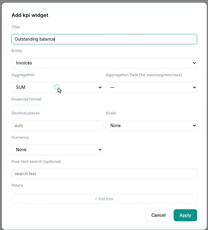
The formatting block is not cosmetic. A balance shown as 1190011 and a balance shown as EUR 1,190,011 are the same number and not the same tile. One gets read at a glance from across a desk; the other gets counted on fingers.
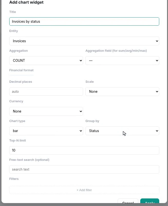
Set the top-N limit deliberately. A bar chart grouped by a field with forty values is not a chart, it is a fringe, and the useful signal is nearly always in the first five bars.
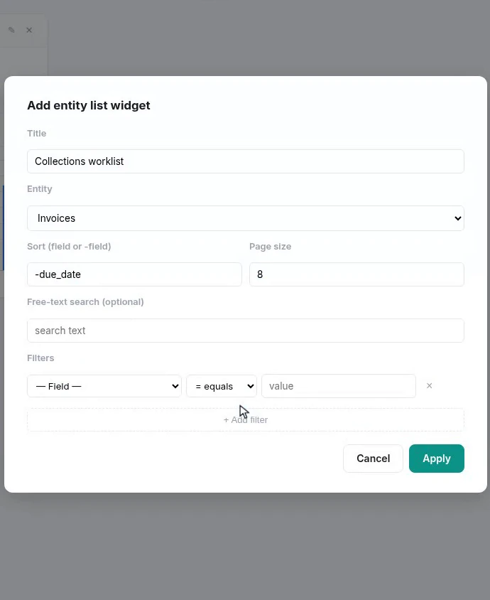
This is the tile that decides whether the dashboard gets used. A number tells somebody there is work; a sorted, filtered list is the work, and it clicks through to the record. Sort by the field that decides priority, page it small enough to fit, and filter out everything already dealt with.
The saved report from Step 2 embeds directly, live, with nothing rebuilt on the board. And quick actions give the page somewhere to go.
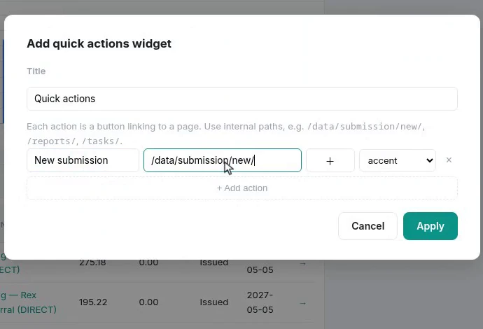
A board with a “New submission” button on it is a starting point for the day. A board without one is a report you look at before opening the thing you were going to open anyway.
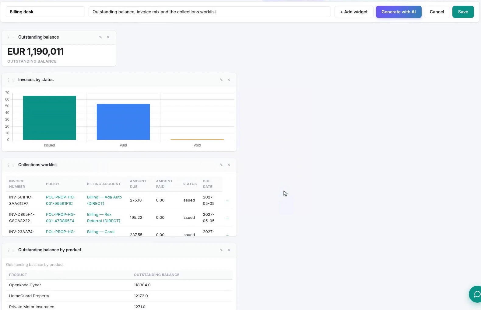
Tiles are dragged where you want them and sized to the space they need. The arrangement saves with the dashboard, so everybody opening it sees the same page, which matters more than it sounds when two people are talking about “the chart on the left”.
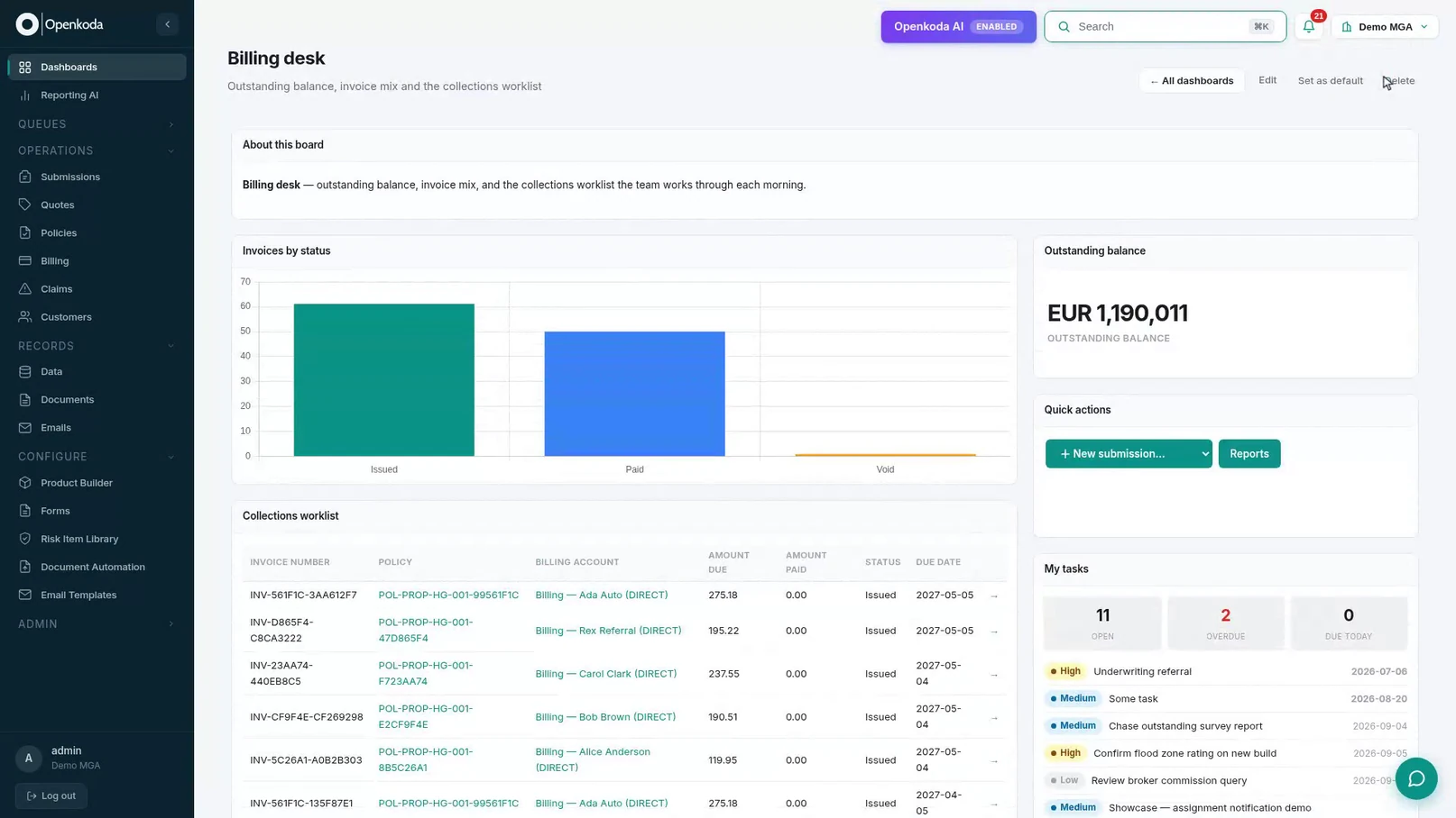
One tile behaves differently from the rest. My tasks shows the viewer’s own work, not the team’s, so the same board shows each person a different list. That is what lets one dashboard serve a desk rather than a person.
You do not have to place any of that by hand.
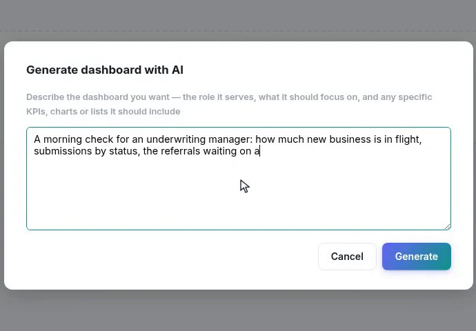
Describe the role and the questions, not the widgets. “A morning check for an underwriting manager: how much new business is in flight, submissions by status, the referrals waiting on a decision” says what the board is for, and lets the layout follow from that.
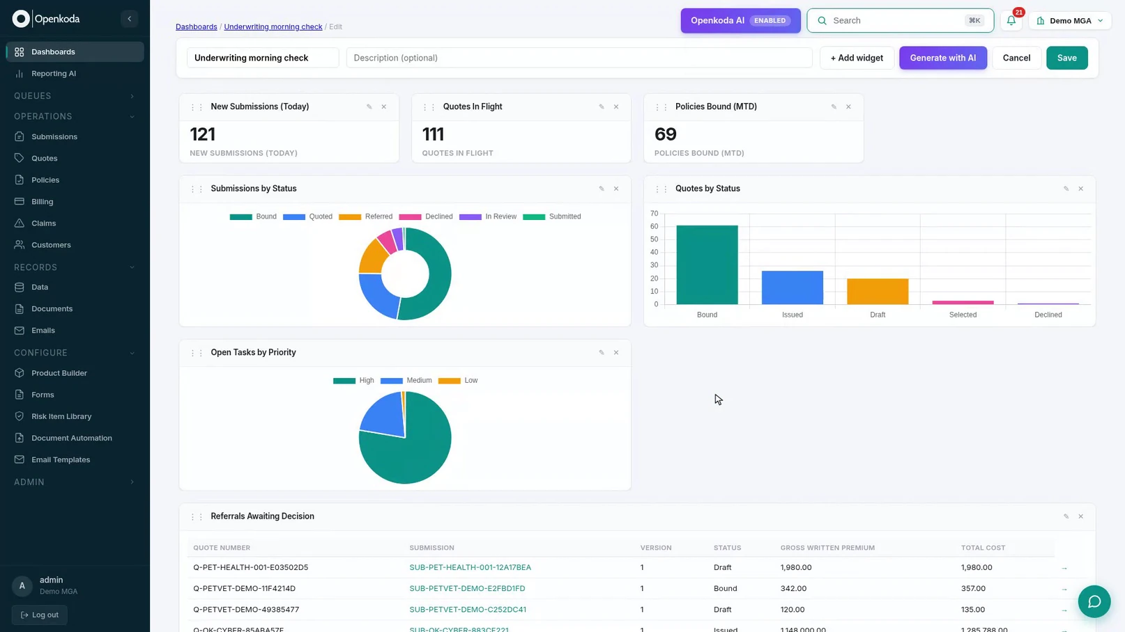
The important words are in the builder. Every tile it produced is an ordinary widget you can open, re-point, resize or delete, so the draft is a starting point rather than a black box, and nothing is stored until you save it.
Two things are worth knowing before you promote one. Every widget only ever queries your own organization’s data, so a dashboard cannot leak across tenants. And each one runs when the page opens, so what people see is current rather than a snapshot from last night’s job.
The interesting thing about a dashboard builder is not what it can draw. It is who is allowed to use it. When a board is seven kinds of tile on a twelve-column grid, the billing supervisor can build the billing desk’s screen, and fix it next month when the process changes, without a ticket, a release or a conversation about priorities.
And when even that is too much, describing the desk in a sentence gets you a real layout to adjust rather than a mock-up to argue about. Either way, what goes away is the queue between noticing what a team needs on screen and putting it there.

Follow one hand-over end to end: a chat message carrying the policy, a task with an owner and a due date, and the notification that reaches the assignee.

Ask for the report in plain English, refine it in the same conversation, read the SQL it wrote, and put the result on the team’s dashboard.
Build a renewal reminder in twelve steps: draft it with AI, edit it visually, bind record fields as placeholders, and let a workflow send it.
Book a live, personalized demo with our product team - tell us your use case and see the platform work with your data. No commitment.