How to Automate Insurance Processes in Openkoda PAS
Automate a claim acknowledgment end to end: a Word template with placeholders, the email that carries it, and a workflow that fires when the claim form arrives.
Ask for the report in plain English, refine it in the same conversation, read the SQL it wrote, and put the result on the team’s dashboard.

Every insurer has the same two-speed reporting problem. There is a set of standard reports that answer last year’s questions, and then there is the question somebody actually has this morning: which product is carrying the book, what the average premium looks like once you strip out the small policies, whether that one line is as concentrated as it feels.
The second kind ends up as an export into a spreadsheet, and the spreadsheet becomes the report nobody can reproduce.
Natural-language reporting is worth having only if it closes that gap properly, and that takes more than turning a sentence into a query:
What makes that possible is narrower than it sounds, and worth understanding, because “AI reporting” covers two very different designs.
The useful one never sees your book. A language model is given the shape of the database, the table names, the column names and how they relate to each other, and nothing that is stored in them. That turns out to be enough, because the hard part of insurance reporting was never the arithmetic. It was knowing that written premium sits on one table, the product on another, and which key joins them.
From that schema the model writes SQL. The query then runs locally, against the database it was written for, and the rows come back to the screen. The schema goes out; the data stays put.
That is what changes the economics of a question. Writing the query was the bottleneck, and it needed somebody fluent in both the schema and the business, which is exactly why the second kind of report ended up in a spreadsheet. Take the bottleneck away and the person who has the question can ask it. It is also the distinction worth putting to any vendor offering this: ask what is sent, and where the query runs.
This walkthrough builds one report through all four.
Before you start, you will need: an account that can reach Reporting AI, and a dashboard you can edit if you want to finish the way this does.
There is a video version if you would rather watch it. The written steps below are the ones worth having open while you try it on your own book.
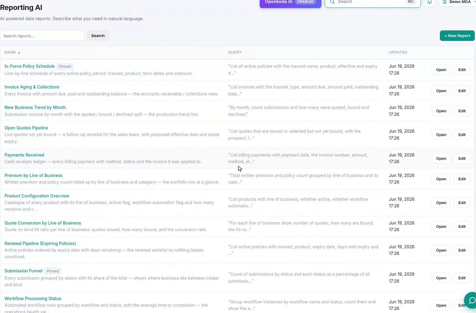
The column worth noticing is the one showing each report’s original question. A saved report that carries the English it was built from is self-documenting: the next person can see what was asked before deciding whether the answer is the one they need.

Be specific about the things a colleague would ask you back about. “Whatever the policy status” in that request is doing real work. Without it, you are relying on the model’s guess about whether lapsed policies count.

Check the row count before you read the numbers. Ten rows when you have eleven products means something was filtered out that you did not ask to filter, and that is far easier to notice now than three refinements later.
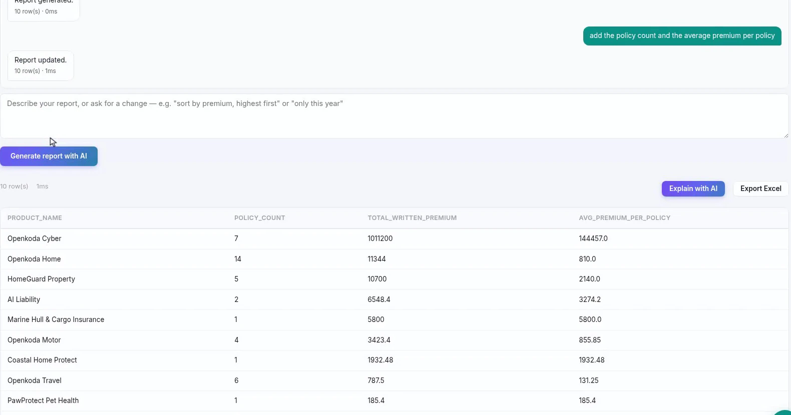
This is the property that makes the difference between a demo and a tool. Each instruction is applied to the query that already exists, so you build the report the way you would think about it: one change at a time, keeping what worked.
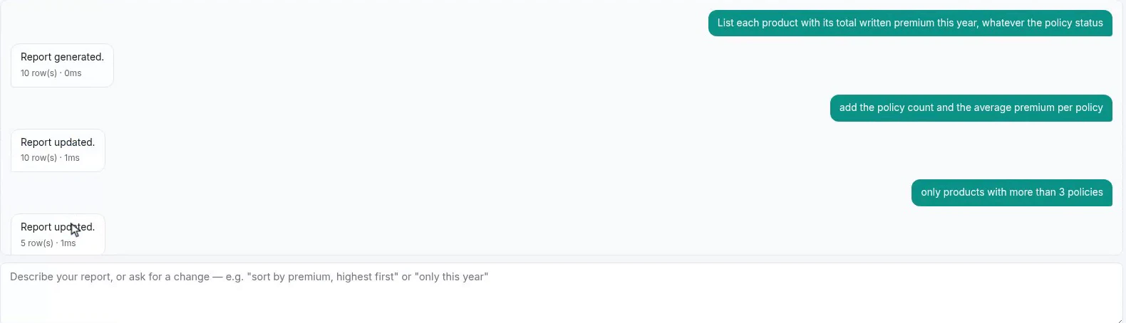
Those two words are your confirmation that the refinement landed on the existing query rather than starting a new one, and the row count falling from ten to five is the filter you asked for, doing what you asked.
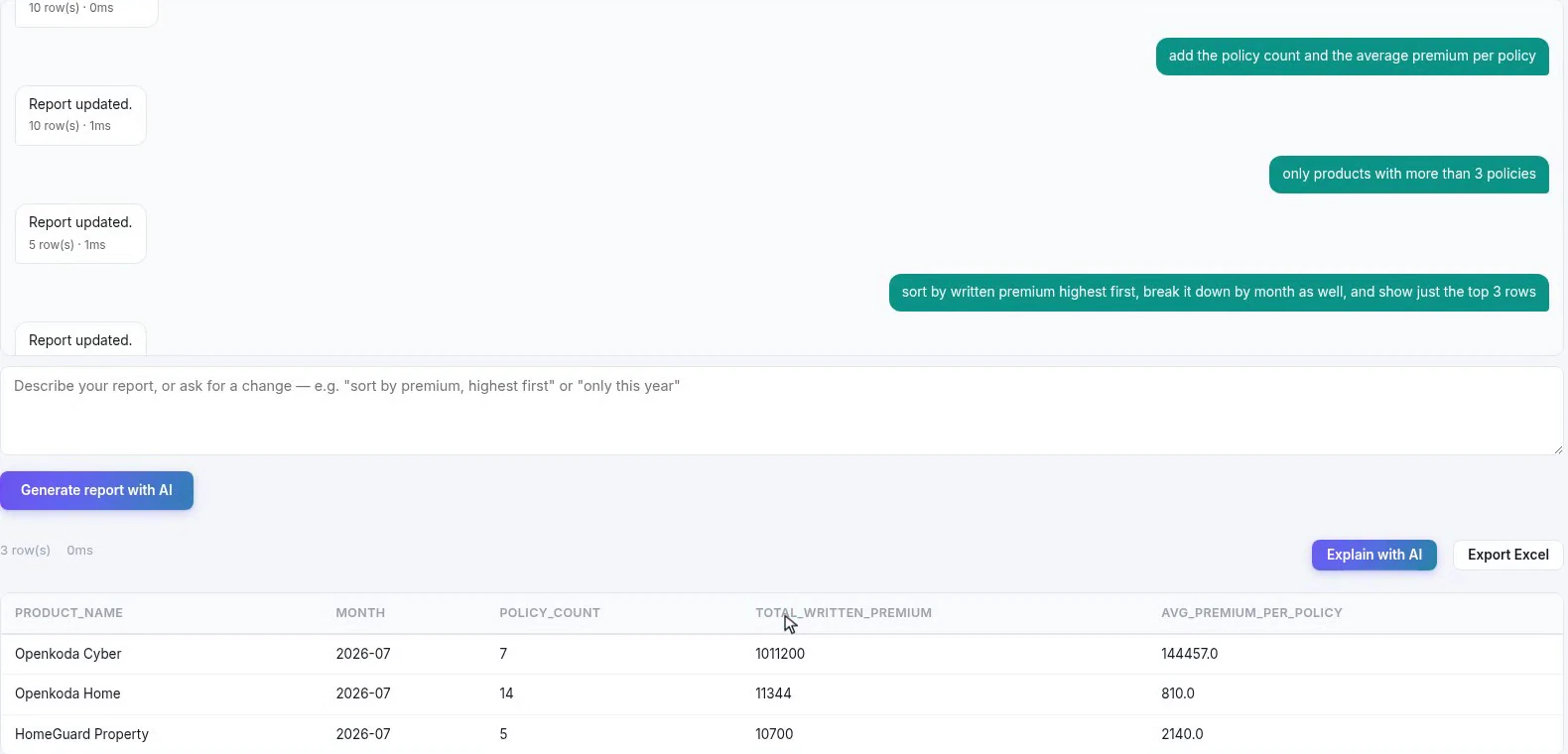
Stacking works, but keep the stack to changes you could verify at a glance. Three instructions that each visibly change the table are fine; six that interact are how you end up with a plausible report nobody checked.
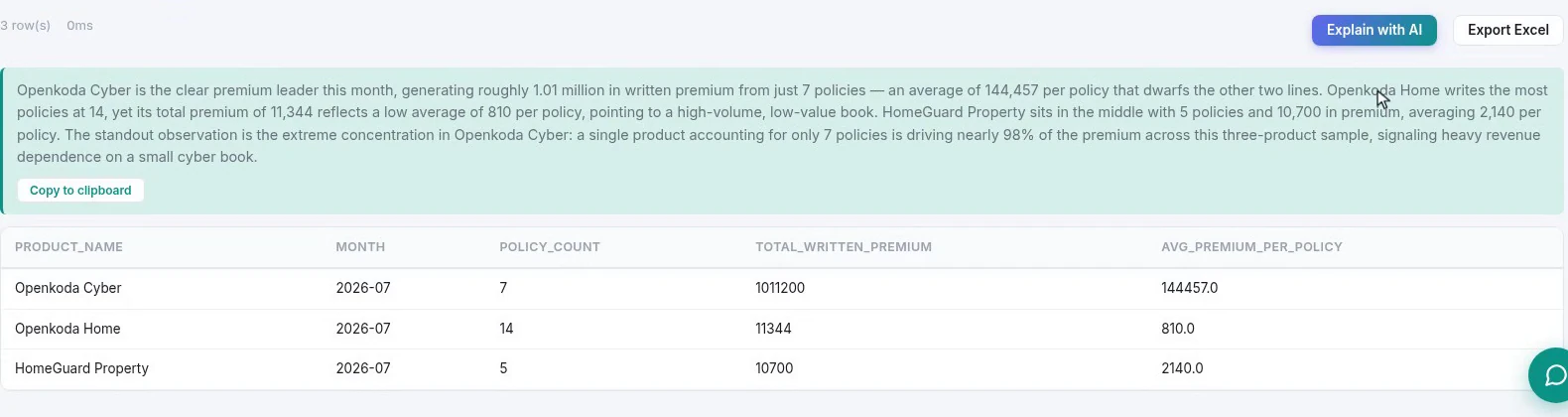
The readout does the thing worth having: it does not just restate the rows, it names the shape. One product producing nearly all the premium from a handful of policies, another writing the most policies at the lowest average. That is the sentence that would have gone in the email anyway.
Treat it as a draft with a named author, which is you. It is reading the same three rows you can see; if its characterization does not match what you read, yours is the one that goes in the pack.
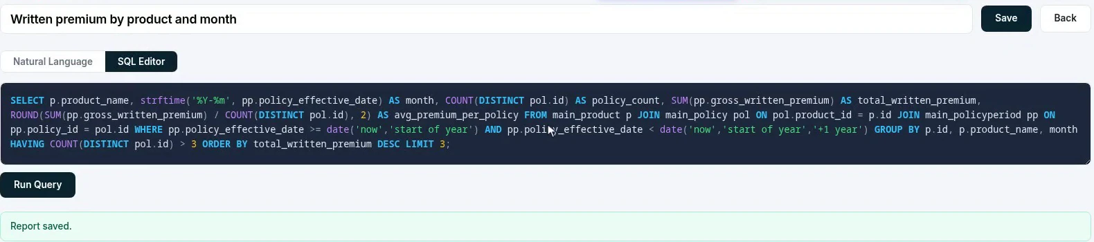
Two things to take from that screen. The first is that the query is readable and editable. An analyst can check the joins, fix a rounding decision, and run it themselves, which is what makes the output usable in a report somebody signs.
The second is what the query does not contain: any filter restricting it to your organization. That scoping is applied underneath, every time a query runs, so a report cannot be made to see another tenant’s data by rewriting its SQL. It is worth understanding that distinction before you let anyone edit queries.
From here it is an ordinary report: export it to Excel for the people who want a spreadsheet, or name it and save it, and it joins the library from Step 1 for everybody.
A report nobody opens is a report nobody reads. The last step is to move it to where the team already is.
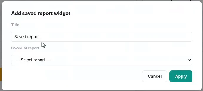
It is the report that is embedded, not a copy of its output, so the tile re-runs whenever the board is opened, and refining the report later changes what the tile shows, with nothing to rebuild.
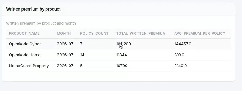
The value here is not that a model can write SQL. It is that the distance between having a question and having a shared, reproducible answer collapses to a few minutes, and that what comes out is a real report: a query you can read, a saved definition the team can open, and a tile on the board rather than a spreadsheet on somebody’s desktop.
Keep the two habits this walkthrough leans on and it stays trustworthy. Check the row count when it changes, and read the SQL before anything goes in a board pack. The point of the answer being explainable is that somebody is still accountable for it.

Automate a claim acknowledgment end to end: a Word template with placeholders, the email that carries it, and a workflow that fires when the claim form arrives.
Build a billing desk board tile by tile, then a second one by describing it in a sentence, and make one the screen your team signs in to.

Follow one hand-over end to end: a chat message carrying the policy, a task with an owner and a due date, and the notification that reaches the assignee.
Book a live, personalized demo with our product team - tell us your use case and see the platform work with your data. No commitment.